- Daily & Weekly newsletters
- Buy & download The Bulletin
- Comment on our articles
Relive the punk era through graphic design at ADAM museum
The punk, post-punk and new wave eras were about more than just music – as a fascinating, visually striking new show at Brussels design museum ADAM reveals.
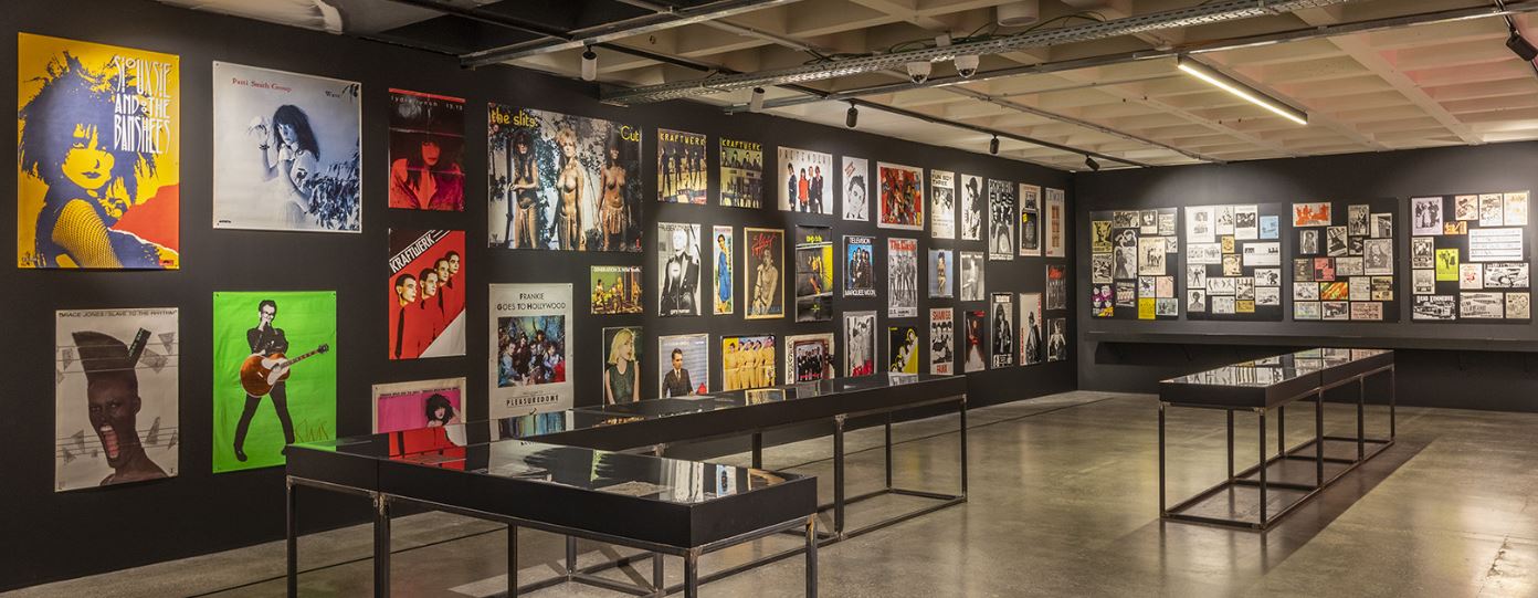
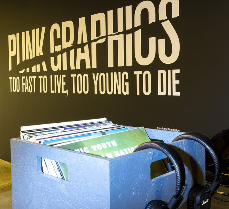
Punk Graphics: Too Fast to Live, Too Young to Die takes a look at the totally original and extremely inventive visual language that came out of the era - a language that would deeply influence overall graphic design.
The show is comprised of 500 pieces from collector Andrew Krivine’s 3,000-strong collection that he has accumulated over four decades. It was curated by Andrew Blauvelt, director of the Cranbrook Art Museum in Detroit, where it was first shown, after which it was presented at the Museum of Art and Design (MAD) in New York.

For this Belgian iteration, curator David Vermeiren has added a Belgian section which shows the local contributions to the movement. The Bulletin caught up with Chris Scoates, the director of MAD, and Andrew Krivine to find out more.
How is the show presented?
CS: The show is not curated chronologically, but in themes, so you’ll get sections that deal with agit-prop and propaganda, a section that deals with cut and paste, another on comic books and horror films. In all there are 11 sections. It’s a design exhibition that deals with music and the punk era from 1976 to 1986. You get all the major designers from Peter Saville to Jamie Reid, to Tibor Kallmin, to Malcolm Garett and many others.

The thing that it’s also important to realise is that all of this design was pre-computer, so Photoshop was not around then. Like the music, this design was really quick and dirty. The music was really about three-minute punk songs; the designs were not dissimilar, they were drawing from, appropriating from many different sources.
The show covers 1976 to 1986 so punk becomes new wave and the music gets more polished. How does that affect the graphics?
CS: In the later sections of the exhibition, it becomes more about geometry and colour. In the earlier stages of the exhibition it’s more in black and white. If you’re paying attention, there is a real subtle difference stylistically and esthetically to the show, although it does still have a kind of a through line that looks at very jumpy graphics that they put together.

What would you like the audience to take away from the show?
CS: I think one of the most important commentaries of this exhibition is that we haven’t really moved that far from some of the politics of the period, so one of my favorite sections of the show is on the agit-prop propaganda, the Rock against Racism section, which was single-handedly, inadvertently started by Eric Clapton, who we all know was a blues singer, but on a drunken rant in a concert hall in Birmingham, England, in 1976, he quoted the British right wing politician MP Enoch Powell’s Rivers of Blood speech, which basically said that all British immigrants, people of colour, should leave the country, while playing I Shot the Sheriff, the Bob Marley song.

That racist rant caused three men in the audience to start the petition in the New Musical Express which started Rock against Racism, the Anti-Nazi League and many others. And you know, whether in the US or whether you’re in Europe these days, racism is not that far away from the centre of political and cultural life so I think that there are a lot of important points today that resonate with the show.
You have thousands of pieces. When did you realise you were collecting?
AK: I really loved punk music - it took over my life for years, and I’ve just always been a collector by nature. And I have to thank my mother: most parents throw the stuff out, usually four or five years after you’ve left the house, and she kept them in her attic. Then about 15 years ago, I brought them back to my house in New York and that became the foundation for the collection.

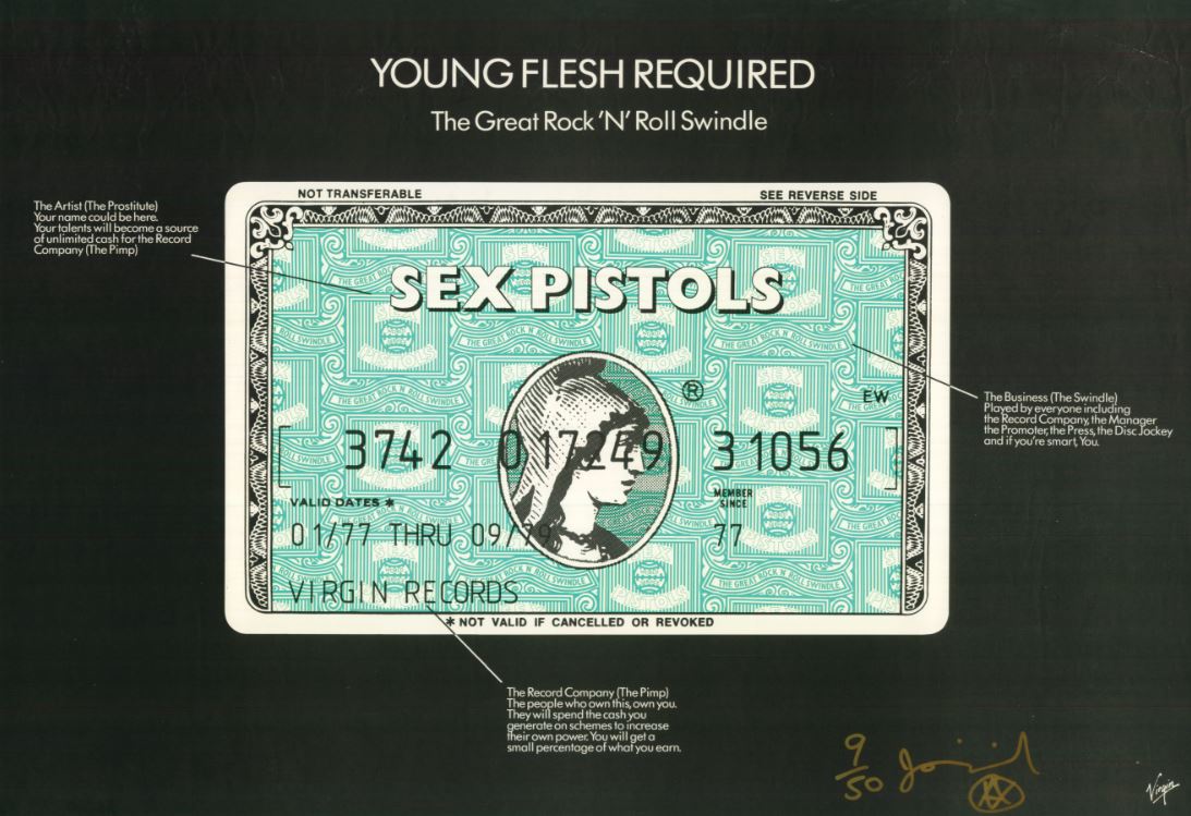
Tell us about the Amex card poster.
AK: That could be my favourite. I think that that could be Jamie Reid’s masterpiece. If you go through the poster you see it’s just a wilting commentary on the record industry, referring to the record labels as pimps, and the groups as prostitutes. I’s amazing, it’s so beautifully rendered. From far away you think that is a real American Express advertisement. And just the title Young Flesh Required, because that’s what the record industry was about, and I don’t think it’s changed, just the industry is much smaller and poorer than it was back then.

I love that you really see that a lot of thought went into these designs. One of my big things about this is that it’s not all untutored, primitive - some of it is incredibly sophisticated and a lot of the people who designed these posters went to art school. I’m not an Anglophile, though the bulk of the collection is British, probably 70%. The breadth and depth of the designs is just enormous and a lot of that is due to the fact that in England they really had an art school tradition, and the government supported the arts. I believe that in the mid-1960s there were 160 art schools in Britain. How many were there in America in the 60s? I don’t know, 20? 30? We just never made that investment.

Other events
ADAM is holding a number of ancillary activities around the exhibition. From January until April, at Cinéma Galeries, there will be monthly screenings, each time a different punk documentary. On 15 December at ADAM there will be a Christmas Special Design Brunch which they claim will be 100% design, punk and Santa.
There will also be workshops, including one for children during the Christmas holidays during which they will create fanzines, posters and transform their old T- shirts and other clothing into punk masterpieces. In March, a Family Punk Sunday is planned and in April, on the closing weekend, there will be free guided tours.
Punk Graphics, ADAM, until 26 April 2020. Exhibition photos courtesy Vincent Everarts. Sorry! Our prize giveaway has now closed and the winners have been notified.


